Friday, August 29, 2014

Project Wilna part 2- Don´t Forget How To Fly

                                                     *Process video*

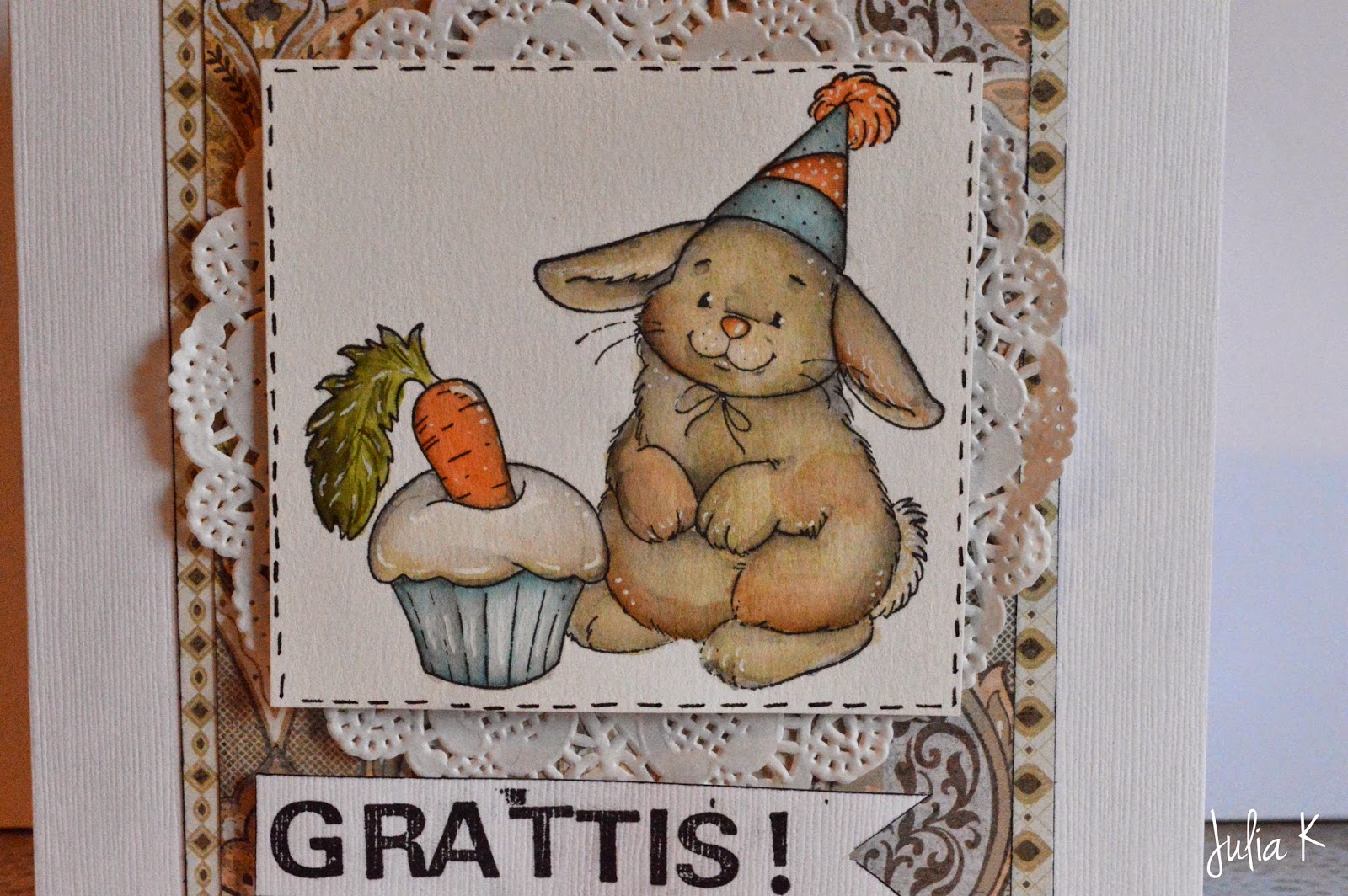
Happy Friday everyone and welcome to Project Wilna part 2!
I´m so glad you stopped bye and well, let´s get started!


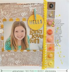
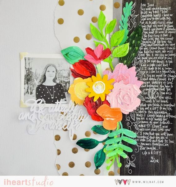
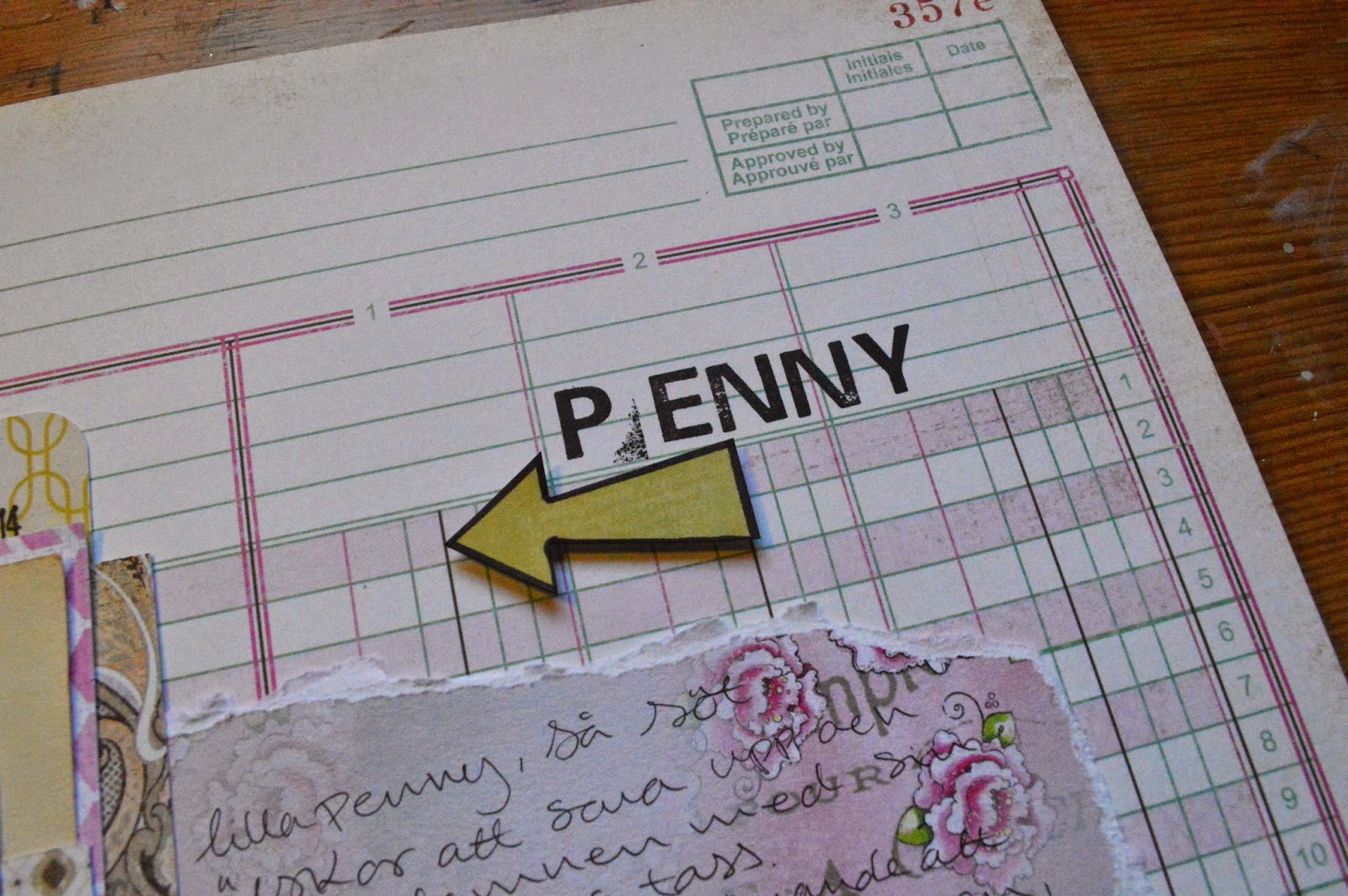
So we start with checking out Wilna´s page:

This layout is build up in three parts: Photo, embellishment & journaling.
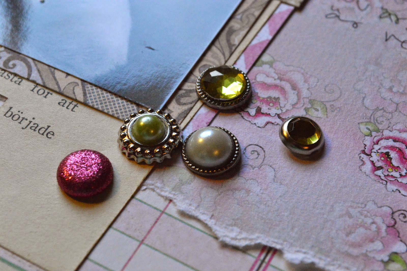
The colors are one of my favorite compo; grey and yellow. The embellishment is ribbon and scrap-pieces with brads/ buttons in changing colors, black to coral to yellow.  Here is her process video check it out to see our different processes.

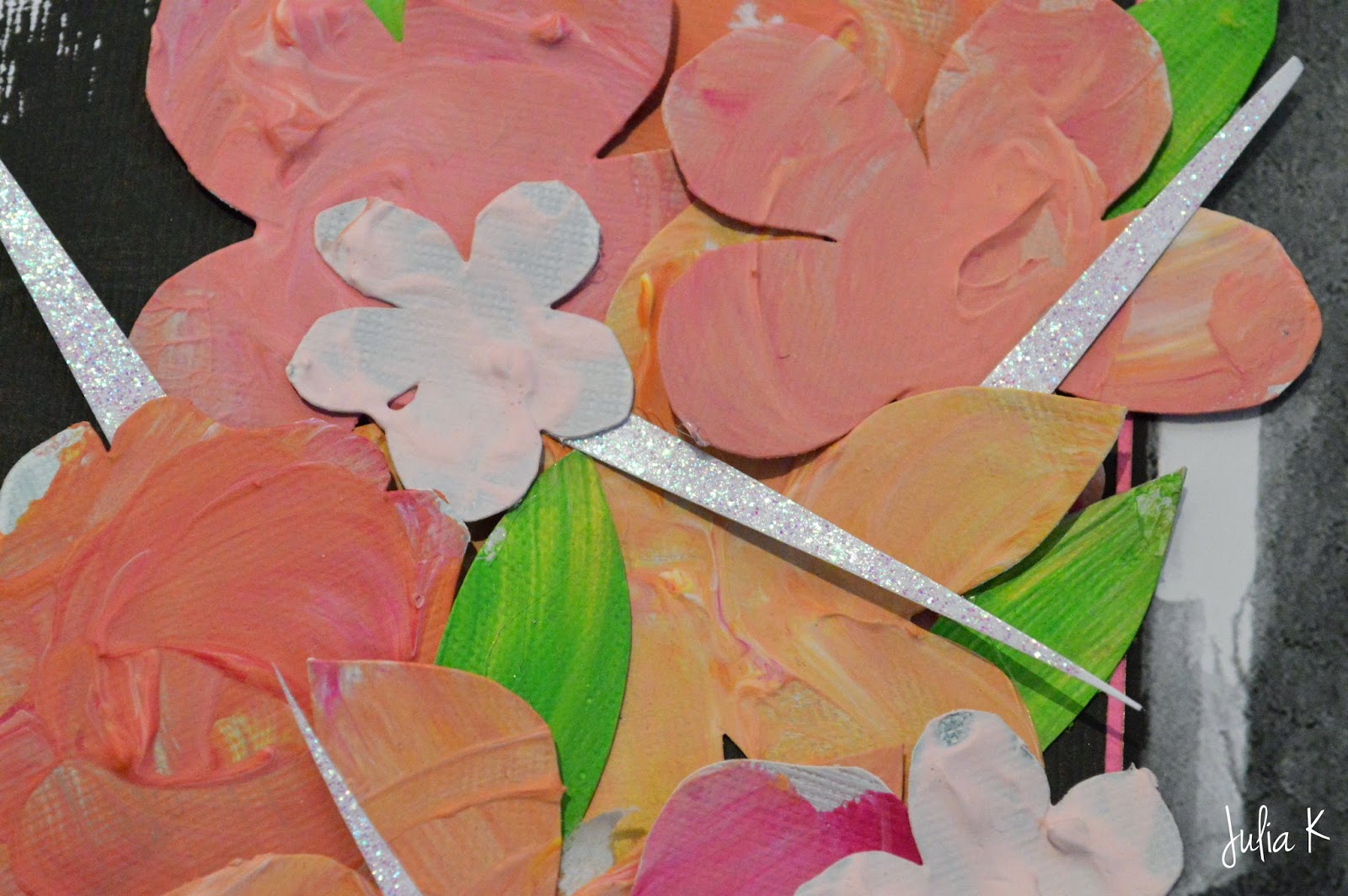
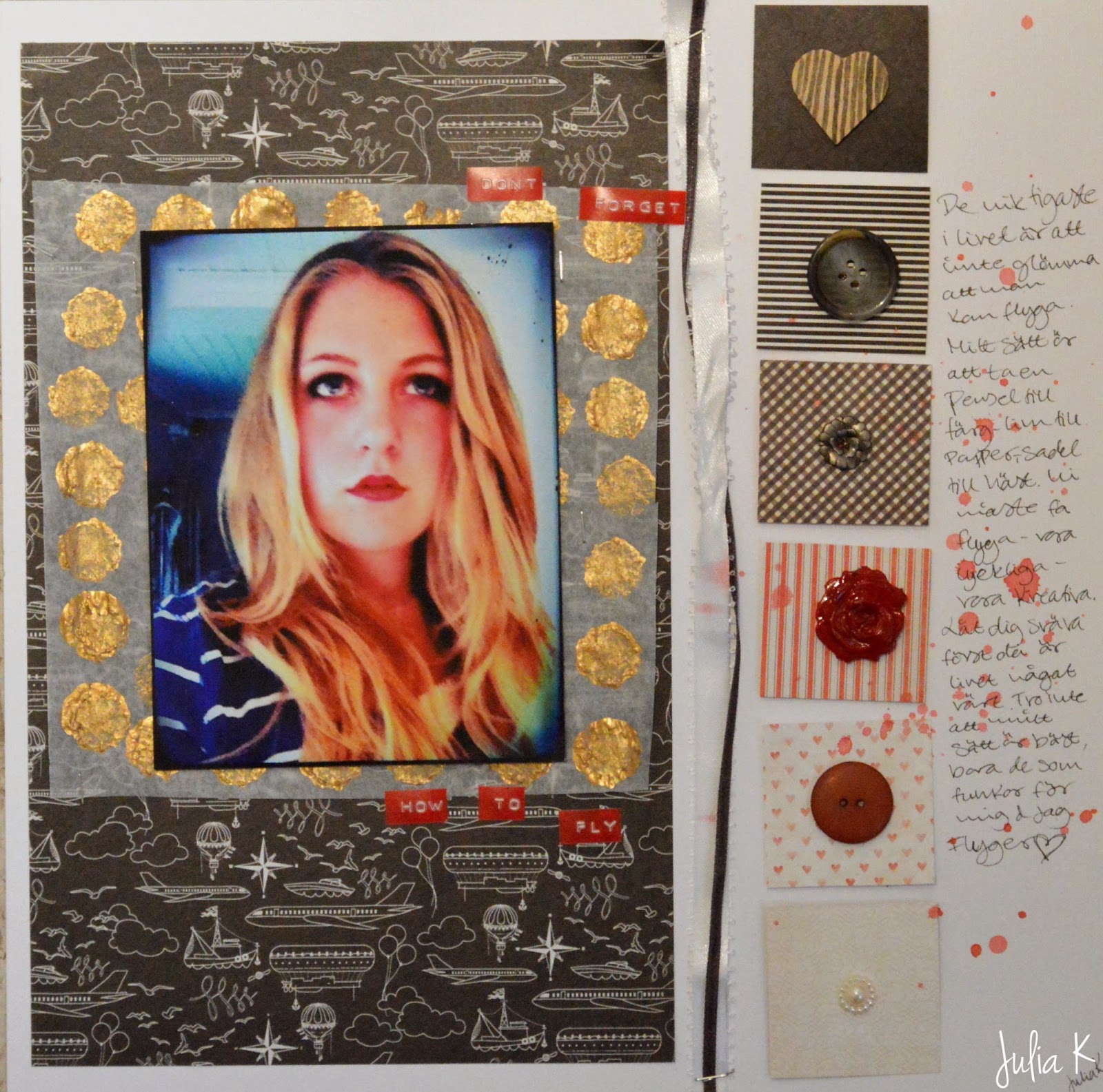
What I will take with me is the layout and the thought with it. I will challenge my self with the colors. I have a hard time making red work so that is the color I picked to go with black and grey.


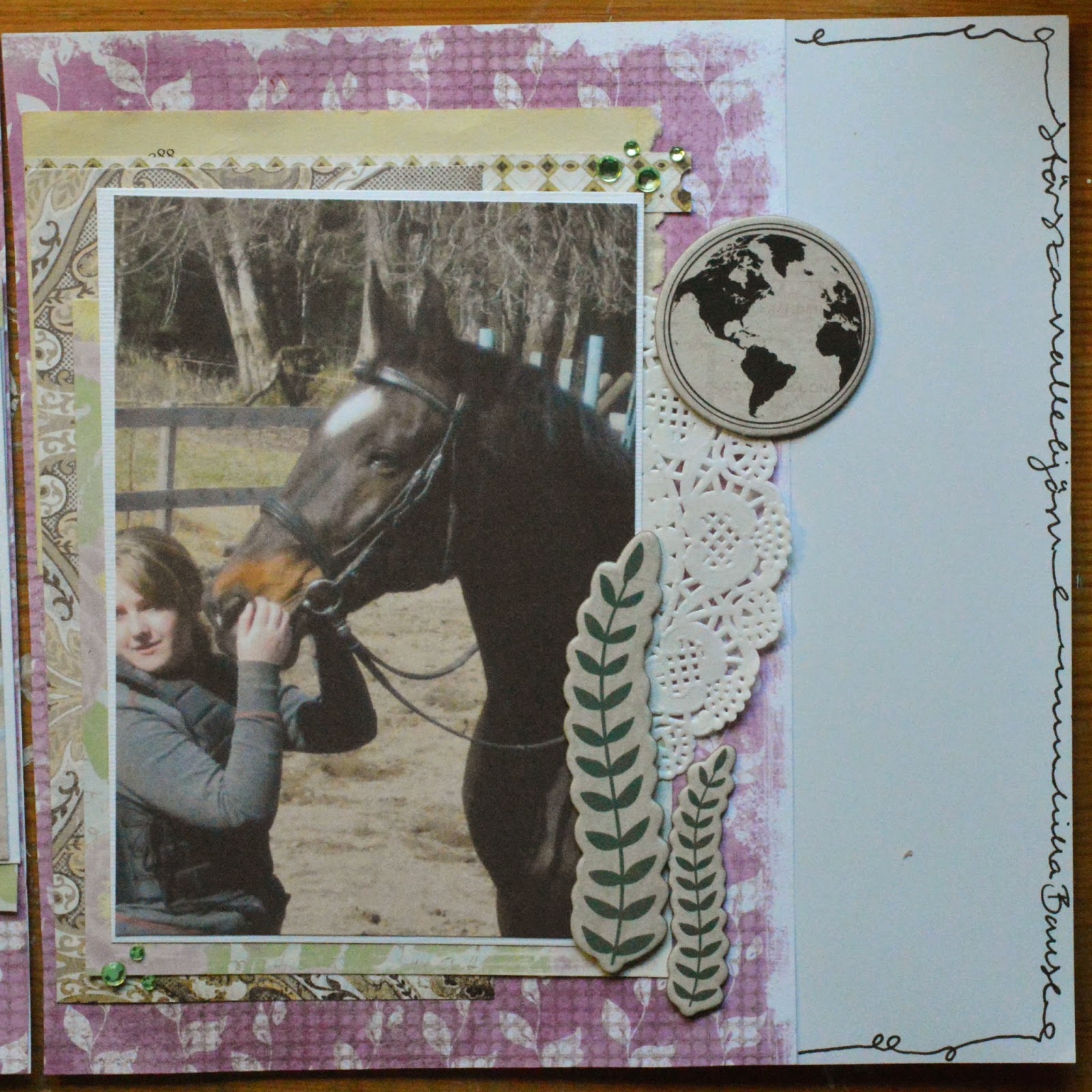
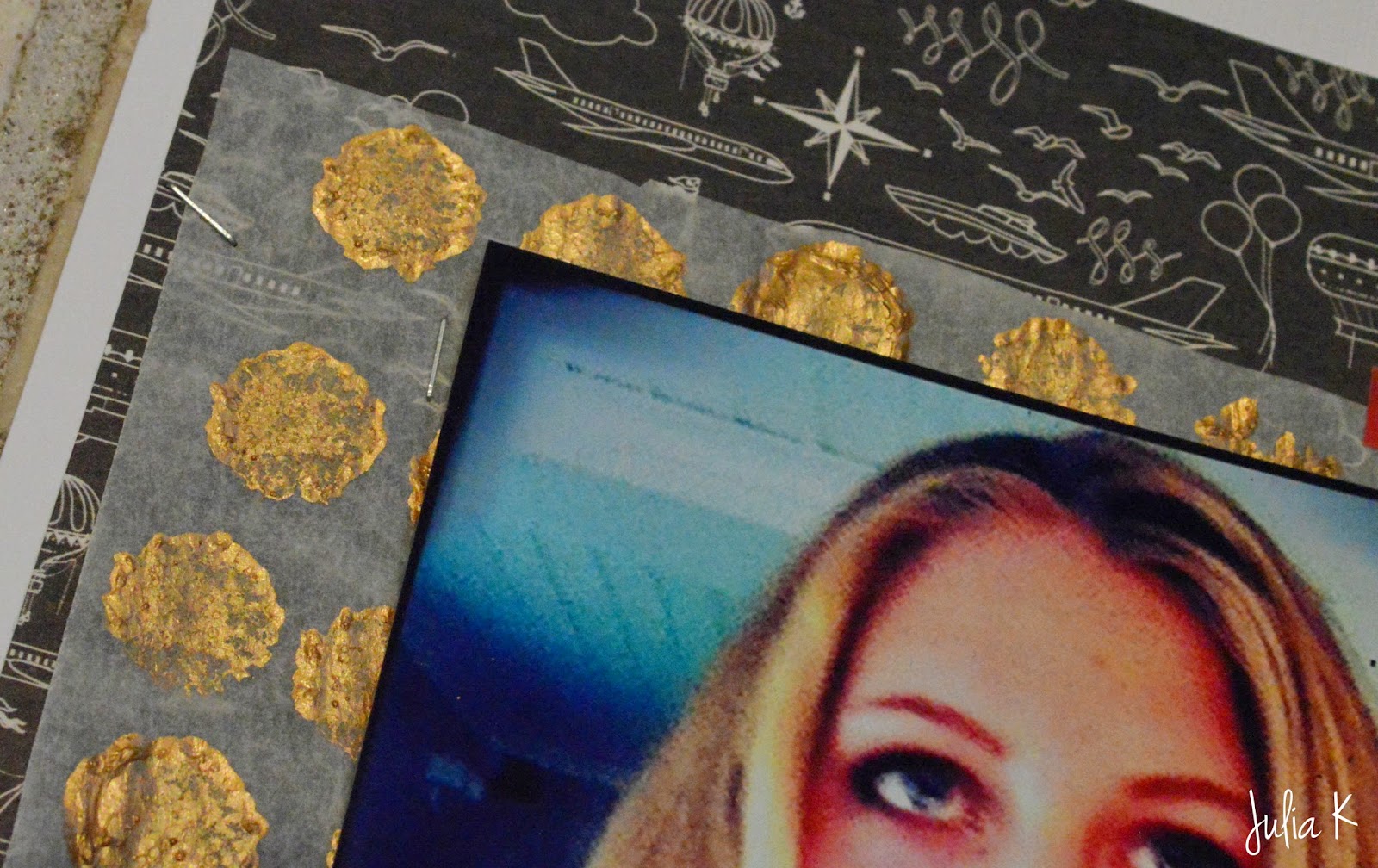
Here is me take in the layout:

Black & White with Red.  Black and white is not hard to work with, but red is. So bringing out the red lipstick in the photo with red dymo, red embellishments and red splatter.
 The background is from Basic Grey and I love it! I have been "saving" it but it´s perfect for this page, with all the flying  shippes. The squares are from My Mind´s Eye: Ruby and goes from black to red to white. Over the journaling I dropped some red mist I mixed ages ago.
 Wilna had matted her photo on a vellum pecie with gold dots. Now, I don´t have any vellum let alone any with dots so I made my own. The paper is what you have when you bake so it´s hard for anything to stick to the surfaces. But Ranger gold paint sure does stick, so I made dots with the old dried dabber.
 I love how the "vellum" turned out but I couldn´t get it to stick...(yes I know how blond that sounds...) so I finally went with staples and cut out the center to stick down the photo.
 I just love how this turned out with the colors and the layout. I would never have done a layout like this if I hadn´t started this project. My favorite part is the gold and the ribbon. I haven´t used ribbon in ages, but maybe I give it a try, this way.

I´m so happy over this page and I hope you give it a try.
Thank you for stopping bye and I hope to see you next Friday for part 3 or if you love project life; on Tuesday for week 34 process video :)

Have a great weekend
Love Julia

Tuesday, August 26, 2014

Project Life wk 33

Hello!                   *Process video!*

It´s tuseday and I have week 33 ready too share with you!
This week I really wanted the layouts to feel light and dreamy. I used the Becky Higgins DIY Value Kit, and took the light grey cards. This kit is by far my favorit. It´s the perfect base with light grey colors, new print, cork and wood grain! This works with any other kit /pad you have.


On this week (week 33 & puppy week 4) I wanted a light and dreamy feel. So I took light cards and de-saturated/ black & white photos. The only "color" is the lilac letter stickers, also them in light colors.

Week 33 is simple with just cards, photos, letters and a few embellishments. Now if I could change one thing is that I would have made the left 3x4 photon less saturated or even black & white.
 Puppy week 4. Same thougt here; light cards, light photos and light letters. Here I went with blue just to emphefas that this is single layout and not week 33 page 2... This worked out better, more cohesive even though there are black & white and colored photos.

I hope you all have a great week and hope to see you on Friday for the next Project Wilna video!

Love Julia

Friday, August 22, 2014

Project Wilna 1- Mirror

                                                 *Check out the process video!*

Hello everyone! By now you probably know what Project Wilna is, but if you don´t... Project Wilna is my latest project, to take all of her awesomeness and create layouts inspired by hers. So today is the time for the first; Mirror!


So let´s start with checking out Wilna´s page: (here is the video) Her page is parted up in to 3, white space with photo, flowers and journaling. The flowers is cut out of a silhouette but I don´t have one so I cut out all of the flowers and leafs by hand. The other thing with this page it the "blackboard". I want my whole page to be painted black. This are the two elements or parts that I will take with my to my page.
 So I took the chalkboard and the flower and made a  plan (for once) I know I wanted the flowers to frame the photo, like they are growing around it.
 My flowers didn´t get as much texture as Wilnas. I went with a different color scheme, softer pinks and yellows.  To get this look I mixed pink, yellow and modeling past. By not mixing the pink and yellow all the way you can get really cool colors. All of the flowers will look different but fit together because all of the colors are the same- just in different amounts.
I wanted a painted look so I didn´t go all the way to the edge with the black paint. This to emphasis that the background was painted. 
 To add some more interest I cut a glitter-paper in tiny, slim triangles to a act as thorns. The glitter pickes up on the pink and yellow and adds a lightness.  
 I really didn´t want this layout to feel dark and heavy, and yes I know- black has a tendency to do that... But I don´t feel that the layout got too dark, allot of of that is thanks to the leaves. They are green but I mixed a bit of yellow, the same way I did with the flowers
 To really get that chalkboard look I journaled in withe, a note to myself. Of course also inspired by Wilna and her notes to her girls.

So to sum it all up: I took two parts of Wilnas page, made a plan that fitted me and went with it! I love how this turned out, simple but with that feeling that I really wanted!


So this was the first page and I hope that you liked it, and the video! I really recommend you to check out Wilnas process first and then mine. All of the videos of the series will be in this playlist: Project Wilna


I hope to see you next Friday!
Love Julia

Tuesday, August 19, 2014

Project Life w 32

                                                   Here is the video!


Hello and happy Tuesday!

Today I have the week 32 spread to show you. This is the week I got my PL stuff so now I´m in phase ;)

 On the right side I used mostly my "mini-kit Blush" As you can see I really liked getting the PL stuff and working on the mini album. (for my mom, filled with puppy photos)
 On the left side I mixed my Blush-kit with Maggie Holmes core kit. And about here my camera cut off...

The fist card is just a 4x6 with a photo.
Second card is just a photo, label cut out of the Blush-kit with the week number.
The 3x4 first card in on a Blush-kit card and a dymo label.
Second is a Maggie Holmes with date stamp and a wooden heart with gold.
Card 3 is a photo of Penny and Florin.
Last 3x4 card is a Maggie Holmes jounaling card and a arrow from the Blush-kit.
The bottom 4x6 on the left side is a photo mounted on a Blush-kit card, with same arrows as on the left side and a cut out label. The 4x6 card in the right pocket is a old Prima packaging that I just love! It´s so cute the the doilys, the only thing is that next week I have to think about it when I plan the page.

I hope you liked this post, I tried to fill in as much as I could now when my camera didn´t...

See you next Tuesday for week 33

Love Julia

Monday, August 18, 2014

August-scrap-kit +a Card

Hello!
Just as I was finished with the kit I saw a scrap piece of a Basic Grey paper and just had to make a final ting with it! So I made a birthday card.   Check out the video here!

The image is a Crissy Armsrtong stamp I colored a while back with distress markers.


A really simple card to make but so cute! I just love how the colors work together and that carrot really pops!
I hope you liked the card, and THAT is the end of the august-scrap-kit!

Love Julia


Sunday, August 17, 2014

August-scrap-kit layout 4 *Penny*

                                                         *New Video*

Hello!                                            
Here is number 4 and last layout out of my scrap kit. It all about little puppy Penny.

This layout is really simple and the focus is on the photo and the bling. The bling in this is some brads that I digged out of my little misc-box in white, pink and light green.

I like the light feel of this layout, with the light colors and then a black and white photo (edited in the Rhonna Design App). The background is from Basic Grey and has the right pink and light green.
 The title is stamped and to get it a bit more grounded I added a light green arrow. Without it the title would just have been floating there without anything really pulling it to the page.
 The hanging thing is a fishing thing... with a heart and some cute brads. The card that is stamped with the date is from the Maggie Holmes core kit and fit perfect. So glad that I checked the back side!
 Putting the brads in clusters helps to draw the eye and pulls the colors together. I didn´t think that I liked pink and green together but I have proved myself wrong...

I hope that you enjoyed this series! All of the videos are in this playlist

Love Julia

Thursday, August 14, 2014

August-scrap-kit +Barock part 2

                                                        *Barock part 2!*

Hello!
Today I have 3 layouts to show you! Witch means that my Barock album is finished! (Part 1 is here) I used allot from my August-scrap-kit . I´m so happy to have it done and now when ever I miss him terribly I can just open that album.

The first layout here is not made with the kit, the 8x8 paper is pieced together with tiny strips from My Minds Eye- Flea Market 6x6 pad. The layout is rather simple with the focus on the photo. Using black helps to frame the focus and creates contrast that I felt this layout really needed with the soft colors and doily. I wanted the all of the layout to go together without looking to matchy. So working with layers and keep bringing black in really does the trick.

I really like this layout with the colors and the blue bling, it really stands out in the album. And just to add some demotion makes a big differences!
 This layout is really 2 but I made them to be 1. I started with this pink/purplish paper from Magnolia, spacing it equally in the two 8x8 pages.  I then added layers from the august-scrap-kit.
 All of the chipboard is from Prima- SeaShore and I think the colors works so good together. The journaling I did is around the layout so it looks like a old phone-wire type. Bye the way, I love this photo of him, it really show how amazing he was! and big! he was 173 cm and I´m only 168cm.
 All of the photos on this layout I printed at home on a plain cardstock and that is why they look so muted. But I don´t think that is a big deal, If I had decided to have them printed I would have had to wait for a long time (we usually order big badges) but now the album is done!
 The last layout is called "Massage" and the photo is of Barock getting massage when he was really sick. He loved this so I wanted to make sure I got that in the album. Here to I have layering going on and of course the black lace washi-tape.  I also used the blue glitter letter from my kit.

I really hope you liked this layouts and this little mini series about Barock. Now I have only 1 more layout left to show you from what I made with my august-scrap-kit and then I have something new on the works that I think you´ll really love!
Till then
Love Julia

Wednesday, August 13, 2014

Make your own mini kit

I have allot of 6x6 paper pads and will never use them up. But I love them especially the My Minds Eye- Lost & Found pads. My favorite is the Blush one, so pretty with the pink and teal with neutrals. So I decided to make a Project Life- mini kit out of the pad.
 So here is all of the shapes after the cutting: 2x6, 4x6 & 3x4.
 I cut 11 4x6, saving the pretty designs, making sure they fit in the measurements.
 I got 26 3x4, of course you can deiced if you want more 4x6 or more 3x4. Or you can just cut them at 4x6 and them cut them down to 3x4 when you need them.

So now I have my own little mini kit from my favorite paper pad... and 24 2x6 paper pieces...
That will be another challenge ;)

Love Julia 

Monday, August 11, 2014

August kit layout 3- Eton

Hello everyone!                                                                        *Here is the video!*
I´m back with another layout made from my august-scrap-kit.
I´m going to be really honest with you now: I love Prima stuff but this paper I really, really don´t like! I like the idea if it, mixed media-ish with doily and ink splatters, but it just looks like a hot mess (so those the other papers in this collection too) And now you think: But if you don´t like it why do you have it, and use it?. Well I got the paper in one of those "mystery bags" and I´m going to use it because I love a challenge!

So I started with my photo (the photo is not that good, dark and bleary so it looks like he only has three legs, oh my) Then I took out scraps from the kit and that was laying around, started to add layers. Now like I said before I´m not crazy over the mixed media feel because I think it looks like a mess but I decided to embrace it!


 Adding black to contrast and interest one of my favorite "tools", no matter how bad it is, adding black works 9 out of 10 times. Like the stamp, so easy to build a pattered! (from Prima, Optimist collection)

I just though to mention something that I do really like sens I was a bit negative in the beginning. And that is this stamp set. I got it to a good prize and it so versatile, I´ve used it on all of the layouts and I know I will continue to use it allot in the future. Stamps really are investments.
In my video I shoe you how you can make this super simple mixed media look with just washi-tape and some stamps. I know there is allot of people that are a bit afraid of the hole mixed media and if you are, starting with just a border with washi-tape and some stamps might be perfect for you...

Now when I look at this layout I don´t hate it, but nether do I love it.  I think it´s a really good layout where I really had to think about it and solve a problem. Would I do the this layout the same way if I got the same paper and photo? I think not, but I enjoyed making it and in the end I had a good time. I said before that I don´t make layouts in first hand to remember a moment. I scrapbook because I love the mix of paper, paint and photos, if I then later have albums filled with memories that is a amazing bonus. 

Love Julia

Friday, August 8, 2014

First Project Life Layout w25

                                                                                                    *NEW VIDEO*
Hello!                  
So It´s my first PL layout and I just loved it. Now this layout I really wanted simple sens I have printed out photos from week 25 to week 31. It´s allot of weeks and I want to finish them before I go into week 32 so that I don´t have allot of "weeks" left to think about.

Anyway this is the first layout and I had three 4x6 photos, one 4x4 and two 3x4 photos. So the only thing that I had to do was a 3x4 title card and a 3x4 journaling card.
 The journaling card is a card with patterned and that is so that the journaling won´t be like; "Read me!, Read me!" I know it´s there and if someone wants to read it they can.

The title card is really simple, letter stickers spells "Vecka" 25 and a date stamp for the first and last day of the week. easy peasy.
 The 4x4 photo is mated on a 4x6 card from Prima- Cartographer with dark wood grain.
'

Overall I like it and I love that I can have so many photos without it looking crowded.
I hope you liked it to and if you want; HERE is the video

Love Julia

Have to tell you!!!

So I was window shopping online... surf-shopping! Anyway I was looking at this stores blog; Scrap-och-Ting and found this amazing free printables from Smäm. I just had to print them out!


So perfect to print out as 3x4 for project life or bigger and frame them. I just had to tell you about this because I love them! 

Love Julia

Wednesday, August 6, 2014

my new Project....

Video HERE!

Project life has become a phenomenon and I have to admit to being a bit skeptical in the beginning.  But after seeing ALLOT of YouTube videos and listening to Becky Higgins on the PRT-pod I started to change my opinion. Before I see PL as something uninspiring and frankly as lazy scrapbooking. (this was at the swedish scrapbook fair, where I saw the first Project Life layouts) But now I know that PL is truly "lazy scrapbooking" if that is what you want it to be and that PL can be unbelievably inspiring!

Now I have been scrapbooking in different forms for about 7 years, in the beginning it was to document me competing with my horses but soon I started scraping "normal" stuff to. When I started I didn´t have magazines or the internet so I just did what I wanted. For the past years I have made allot of cards and layouts but the layouts are more to satisfy my artistic needs and to so much for memory keeping. I love doing what I want, not having to fallow "rules" about titles and journaling. But I would love to scrapbook my life...

So I decided to jump in to the PL pool of memory keeping. I knew I wanted Becky Higgins stuff and strted to look around. Shopping in Sweden is about twice the cost (think about that next time you go out to buy a core kit...) and the cost for shipping is out of this world, so I looked at Amazon- free shipping! How ever when I finely decided on a "Starting Bundle" there was shipping anyway, and that was more then products!

I then went to a Swedish webb-shop and spent a few days deciding on what I wanted.
Now I´m so happy I did this because that meas that I got the Maggie Holmes core kit and album! I really wanted a kit that would FIT me and this one is perfect!
 

The core kit is amazing and the colors so pretty! I watched allot of youtube videos and many organized their core kit in the tray like this. I have them by journaling, patterns, filler and misc. I don´t know how long I will have it like this but for now this is it. ( I have take out 4 of each 3x4 card, that is why it looks a bit empty ;) )

I´m so exatied to get started and you can count on PL-process video coming up in the near future :)

Love Julia

Tuesday, August 5, 2014

August kit-layout 2: Kerstin on walk

Hello!

I´m back with a new layout using my august-scrap-kit! This layout was inspired by a spread in a magazine, the pastel colors with the black

The kit was put together with a vintage and shabby chic feel in mind but picking put some colors and going with a white cardstock can change everything!


              Here is the video!


So light yellow, blue and pink with black accents. I used a stamp from the optimist stamp collection from Prima to stamp a border around the edge. The paper-layers are put around the photo in like a T-shape to help draw the eye.
I used the same blue glitter-letters from the previous layout together with my dymo and black letter. The resins are from a mod pogde  resin mold, painted with white paint and distress ink.
 I just couldn´t stay away from the black lace washi-tape but it just works with everything!

I hope you like the layout and don´t forget to check out the video: HERE

Love Julia