Monday, March 30, 2015

Project Life week 13

Hello!

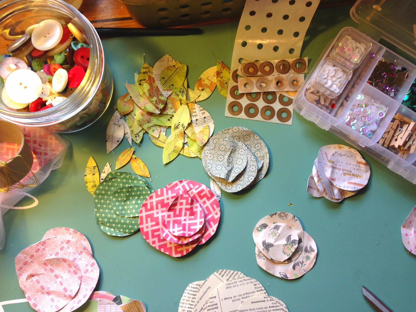
For this week of Project Life I really wanted to try to get a calm and soft page.


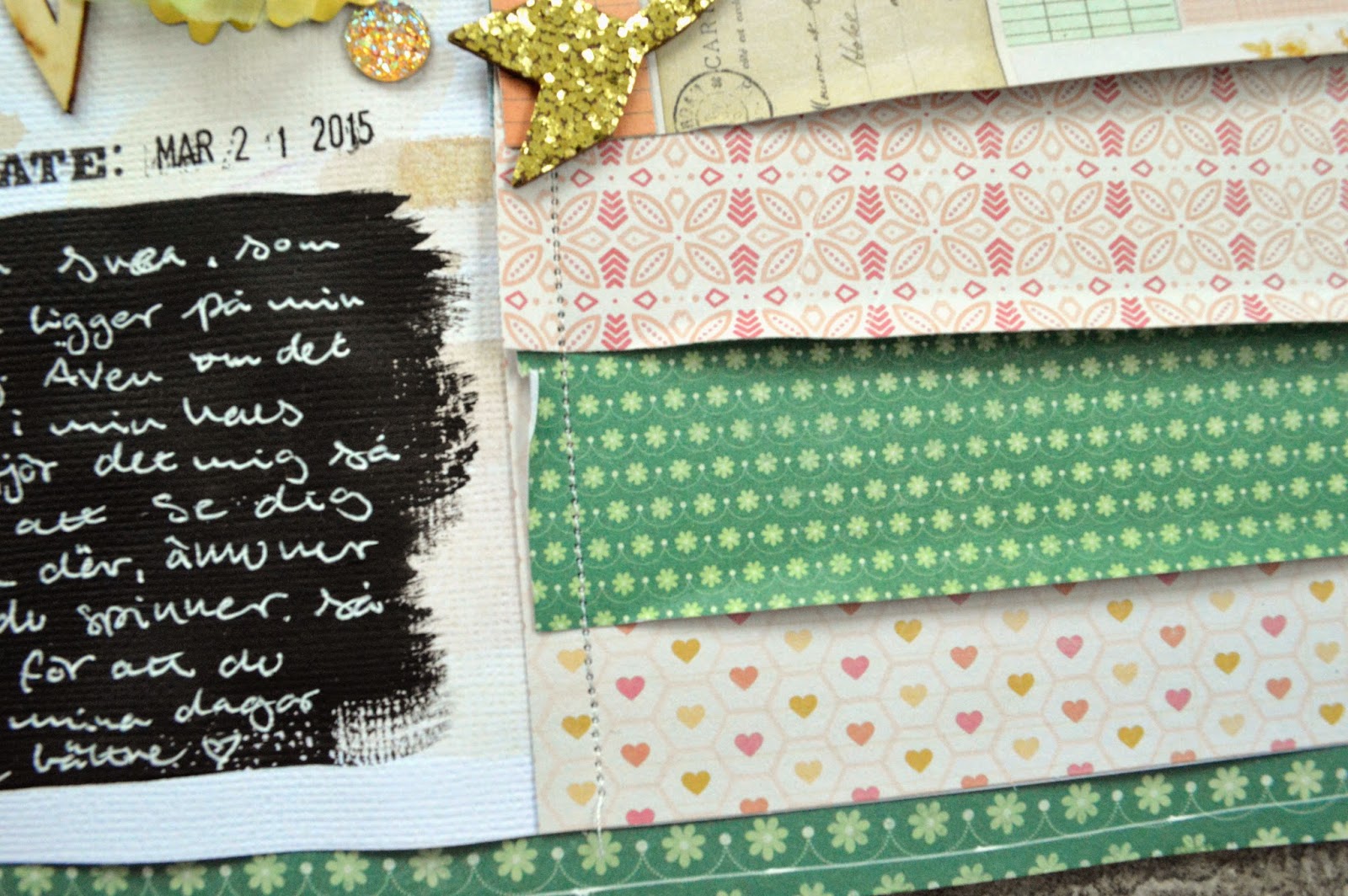
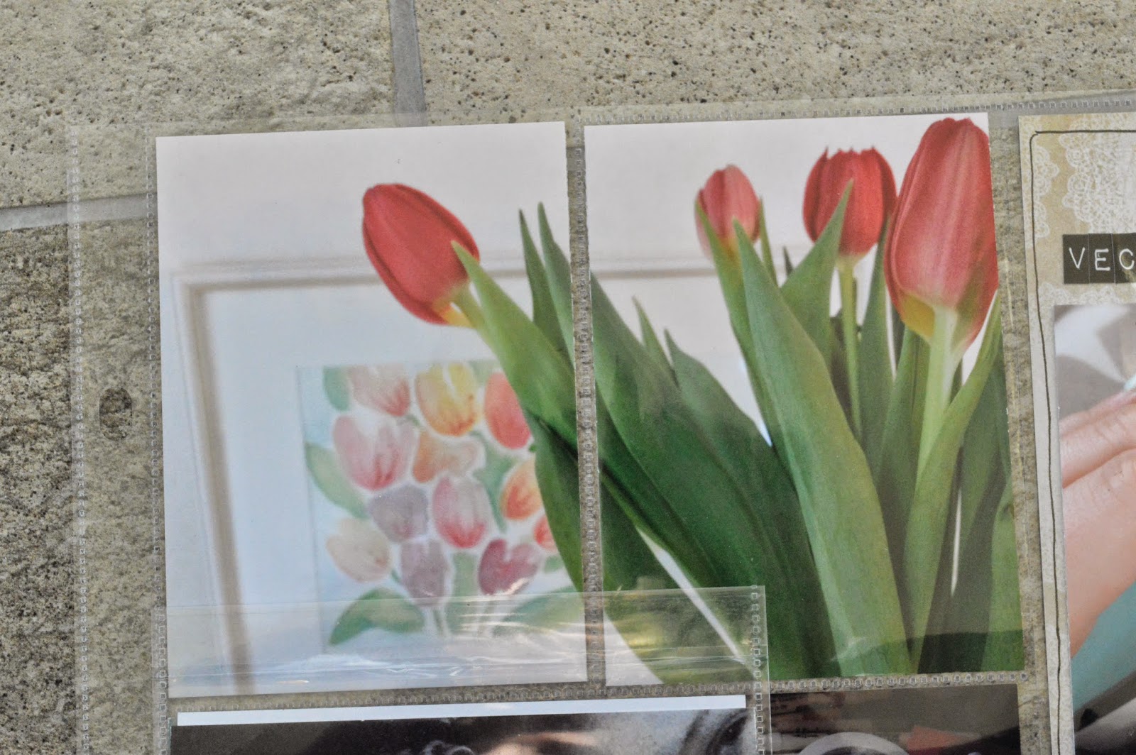
I printed my photos from the "Collect" app, giving the photos a white frame and journaling. Just this made the page allot more calmness. Adding the colors from the Teresa Collins- Life Emporium just underlined that softness without it getting too girly. The colors in the papers went to well with the colors in the photo and together it´s very harmonious. 
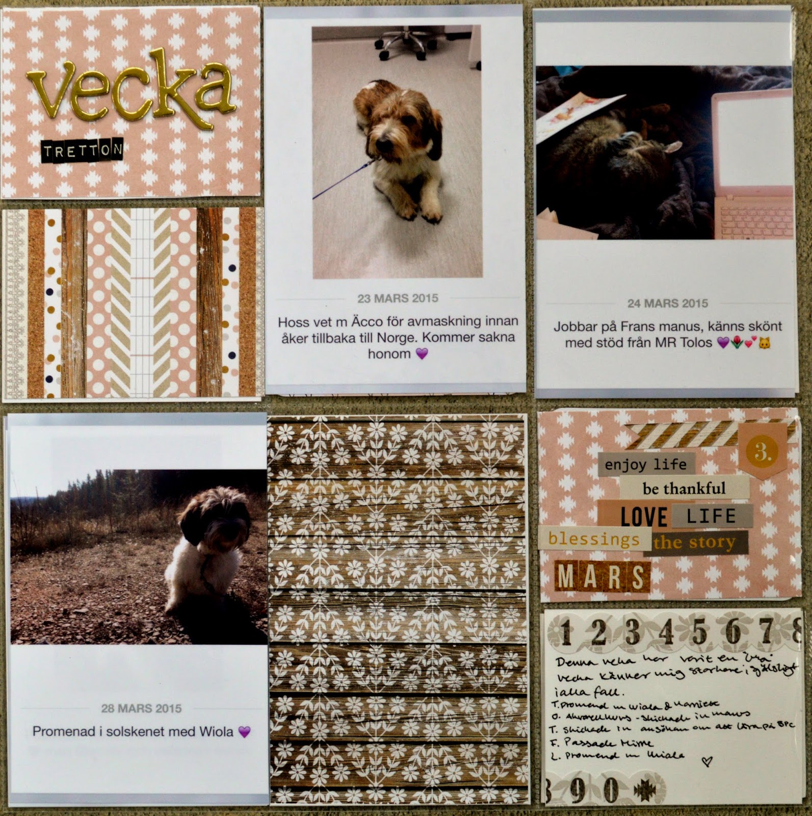
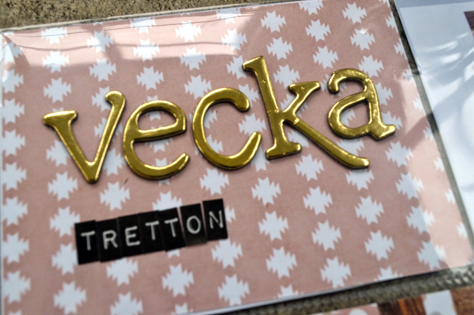
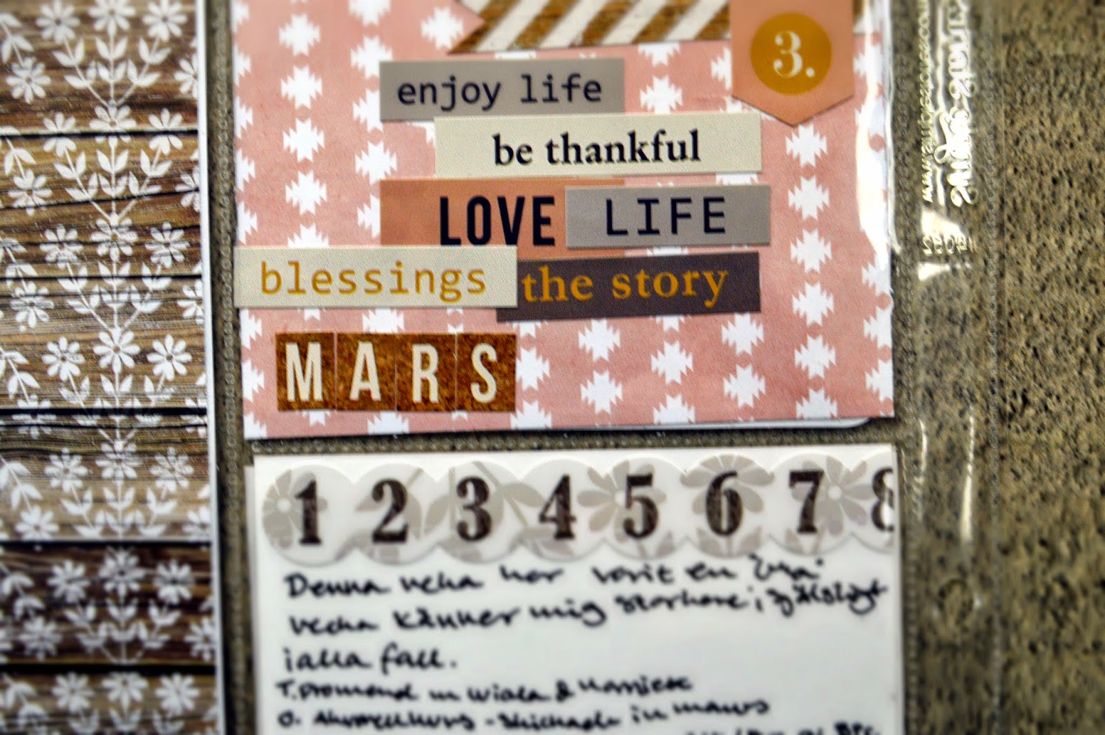
 Now let´s just take a moment to appreciate this Thickers- Sentiment
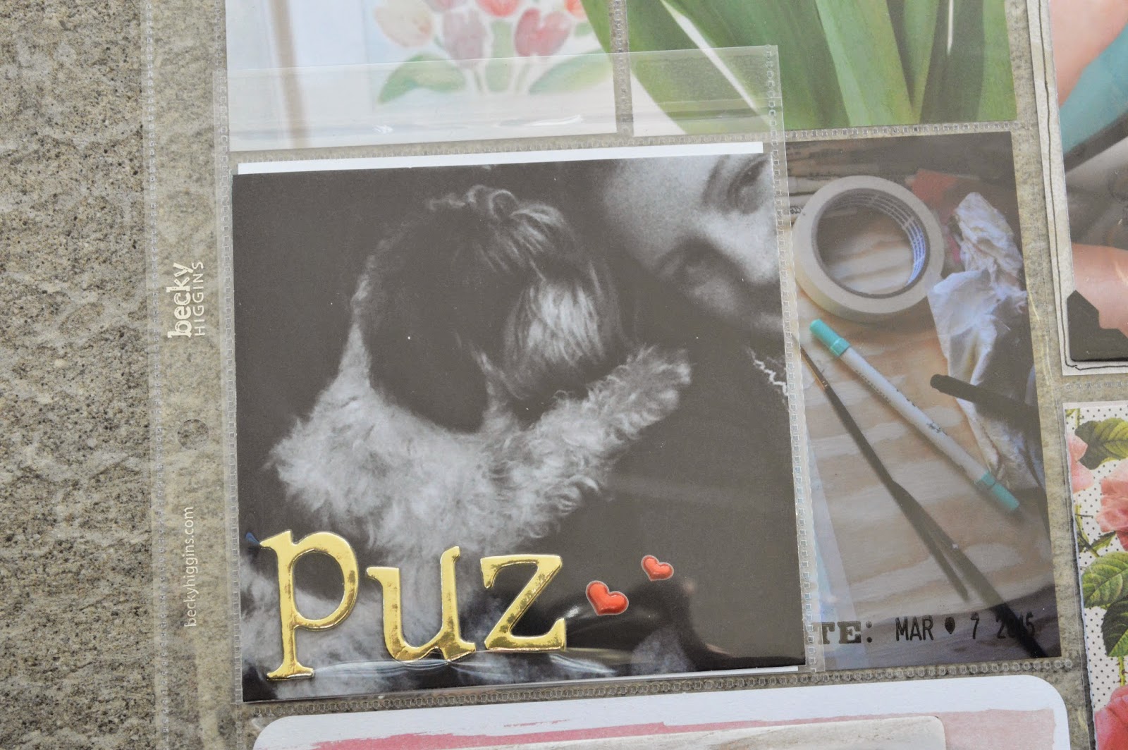
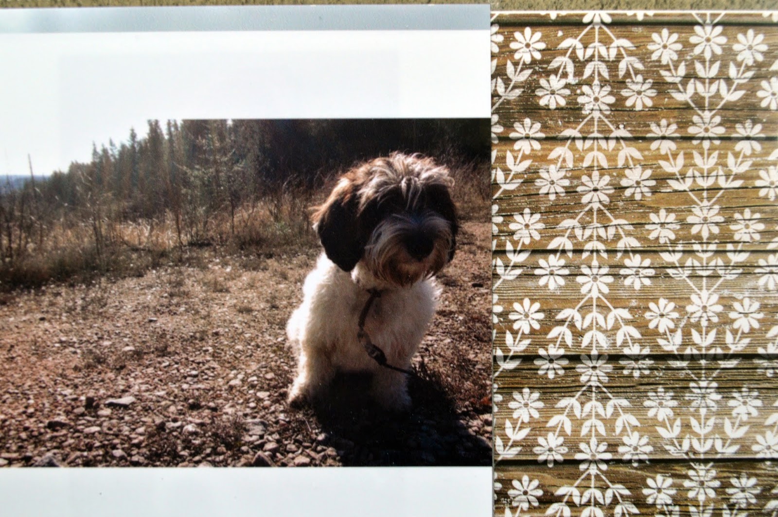
 So cute she is, miss Wiola. The 4*6 paper with the white flowers are one of my faverots from the collection and I just left it as is. I really like how it looks, letting to just be a 4*6 with a pretty pattern. 
 The one thing that I´m not overly found of is this card but I still let it be... Well maybe I´ll go in and change it later X)
Love Julia

Saturday, March 28, 2015

Hej! Scrapbook Layout

Hello! Toady the sun is shining and the birds are singing. I´ve just got in from a walk with miss Wiola and thought it would be suitable to share this layout with you all!


The photo is from a few weeks ago before we left for our skiing trip and left the dogs with my sister. She looks so sad in this photo, like she knows we are about to leave her, so I wanted to do a layout about that and that I will never be able to say goodbye to her.
I really like the colors of the papers to the black & white photo and the watercolors in the background.
 All of the papers where stitched in to place with my sewing-machine and I just went around this flag  for extra detail.
 Just a single flower to tie in the colors and patterns in the layout and 2 gold-glitter hearts to finish it off. I wanted to use a chipboard frame but non seamed to fit so i took a smaller on and put it of the photo to frame the journaling in stead. I think we forget to see frames as embellishments, they can be used in so many different ways. 

Love Julia

Thursday, March 26, 2015

Cute Flowers from Scraps

Making embellishments from your own stash should be both fun and easy. We all wish we could buy scrapbook supplies for thousands of euros, pounds or dollars but not many of us can. But what we can do is make super cute stuff on our own with just the scraps in our stash.

So let´s get started with a cute flower. When I do this I turn my desk in to a proper buffet table. Buttons, string, tulle and papers cut in to different sizes circle. (When I say circular I mean a sort of round shape. I can´t cut a round circle even if i´s drawn before so a roundish shape is fine) I put the papers in sort order, pattern and text paper. I like to use bookpages to add a natural layer.

To put this together I prefer my glue-gun but be careful, I have burned myself more time than I care to admit... Start with the bottom circle size of your flower and glue the other layers on top. Add string, tulle and what not in between to add texture and scrunch up the paper if you don´t want it to just lay flat. Finish of with some leafs and a center, like a button. 


No just keep going, I had a hard time stopping, try different combinations and sizes! Add this to your layout, pocket page och home decor for a cute hand made look. No flower will look alike, different paper qualities, pattern and texture makes this fun to keep trying when you know you will get a unique look everytime. 

Love Julia

Wednesday, March 25, 2015

This is Svea -scrapbook layout

Hello!

Here is a layout with my favorite collection, Open Book, of my favorite cat, Svea.

Lets jump right to it. This layout is made with the Crate Paper Maggie Holmes -Open Book and if you have seen some of my videos or read some  of my posts you might have noticed that I have a thing for this collection. And I on this page wanted to go with do a panel of different paper in light color.
 The photo is dark, well Svea is black so, and I have it in a frame from that same collection. Around the frame I used similar flowers to create this free feeling
 Sens the photo is so dark and the paper so light I wanted to some more black to bring up the contrast. So I took a no-perfect brush and made journaling spots.
 The patterned paper is put down with my sewing-machine, I love that tiny added texture and then just distressed the edges.


 Flower from the Open Book and the fabric is from Prima as are the bling. And I have to say I love how this cluster turned out with the colors and textures. 
Love Julia

Monday, March 23, 2015

Project Life week 12

Hello!

It feels so good going in to week 13 and having week 12 done! Not that I was very late last week but I just really love doing my project life on Sundays. And I have to say I´m so happy with the colors for this week, purple, navy blue and light green! I just really love cool colors.


 I always try to fit in movie tickets, either like this or in my month pocket. (I have a 6*8 pocket for each month to put stuff, like movie tickets, postcards and misc.)
 Here is just a 3*4 from my watercolor play.
 The other day we had a really pretty sunset so I had to head out and capture our lake. And turning around, our house with cotton-candy pink clouds. 
 I love the Lucky Charm Value Kit and really wanted to use it for this week, but  I also took in a 4*6 Love Note card to balance the colors
 When I first got the Sn@p pockets I wasn´t sure i would ever use them, and not use them all. But I have! They are great and so fun to work with, adding 2 extra photos without any bulk or fill it with glitter and sequins. 

Love Julia

Saturday, March 21, 2015

Project Life week 11

Hello!

I love living in the depth of the Swedish forst don´t get me wrong but living here is so not good for my YouTube channel! But after 3 days the week 11 is up!

Design G is my favorite and this is my last one, and my usual store are out of stock! Well well, here it is :)


Love Julia


Thursday, March 12, 2015

Project Life week 10

Hello!

Here we go week 10, the week 10 page all of my favorites: Open Book, design G and gold letters.

I finely think I´ve figured out the camera setting, lets pray it works out! So now you get see what I do. And another good thing is that I really like the weeks page. The pocket design is by far my favorit and I love the colors.
 To fit another photo I used a pocket from Sn@p and on the photo I have my favorite gold letters and two red puffy hearts. The pocket is 4*4 and the photo under is 4*6 but I really don´t see that as a problem.  
 when lifting that pocket is a photo of my desk and just a date stamped in the corner. 
 The title card is from "Open Book" with that amazing flower patterned ripped on ether side and those gold letters.
 In the 3*4 pockets I just cut this photo in half and I like how the red on the top och the layout comes again on the title card, making the layout feel calm.

Love Julia

Friday, March 6, 2015

Art Journal: Life is blue

Hello!

So today I made this art journal page to all of you! I have had comments about my other pages and that some feel that they want the look but can´t paint (rubbish!) So I thought I´d share with you a super easy way to get that look!


 Now I did this page really plain so that you could really she the reindeer but of course you can keep building. I started with a napkin that I painted over, this way I have a guide to help me with the "hard" part.
 When I was happy with how he looked I took a lighter color and added highlights without trying to blend them. This was you get that painterly-implosive look
 The last thing I did was to add stamping "randomly" (of course it´s not random but you get the drift) in black to bump up the contrast.

I hope you liked this quick tip and give it a try. Have a great weekend And I hope to see you all soon!

Love Julia