I have the last layout in the fine& dandy challenge to show you, where I use the 6x6 paper pad from Dear Lizzy fine & dandy collection
In this one I went back to the 12x12 and started with a white cardstock. I wanted to have a panel with different pattern papers from red to pink to white and then sewn down. And if I say so, it turned out pretty close to what my plan was.
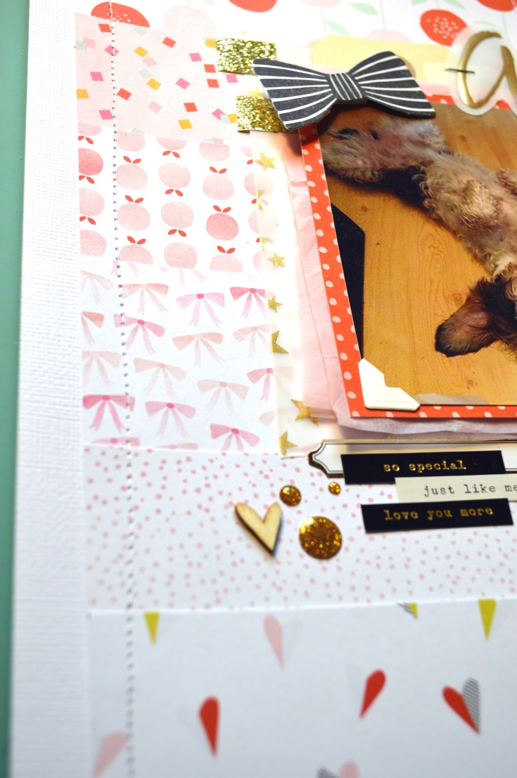
Whit all of this light colors and patterns I wanted to bring in black to humph it up. I love using black as an accent color, here I have the tiny word strips from Maggie Holmes and from her also a black & white bow.
The title is part Maggie Holmes too, I think you is the queen of ephemera packs!. The vellum word "adorable" is from her Confetti line and "Wiola" is thinkers Gilded
The heart and the gold dots are from Studio Calico, the word stickers from Maggie Holmes and the label is from Teresa Collins
Here I wanted to play with the layers under the photo so instead of just patterned paper I also had some pink tissue and that fun star vellum from Maggie Holmes.
I hope that you have liked this little series and that i will see you all soon
I continue with this super fun challenge and on this layout I picked to go together with the Dear Lizzy Fine & Dandy pad, the labels from Teresa Collins and the Thickers are "Gilded"
On this layout I wanted two things, a grid design and stitching.
I´m not a master sewer and can´t sew a straight line... ever! but sens there are so many layers you can´t even tell it´s all wanky. And I love the feel of it!
I´m not a red fan but here it just worked, with the photo and the together with the other colors
When I first noticed this gold labels from Teresa Collins I just had to have them! But you all know how it is when shopping online... The foil is really good, but the label is a bit to slick and if you don´t have a steady hand, it will be a mess... But they are so pretty!
Before I sign off; make sure that you don´t have any wet on non-porous things. I did and when I put it in it´s page protector it smeared all over! that tiny drop!!!
Hello!
I have something really fun going on! It´s a personal challenge (like I need another...) and I love for you to play along. All you need is a 6x6 paper pad that you haven´t used, don´t know how to use or just find challenging. I have been eyeing the Fine & Dandy pad by Dear Lizzy for quit a time, thinking that I
wouldn´t like it, it wasn´t for me and had the "wrong" colors. But I can´t resist a challenge so I got the pad and now three layout later I find it so fun and energetic to work whit!
Here is the first layout, a A4 witch is new for me. I wanted to focus on the photo and layer all of this fun patterns to add interest. Also a thin strip at the top and bottom to frame the layout.
Mixing collections can be tricky but here with the Fine & Dandy I used tiny word stickers from Confetti by Maggie Holmes and they work so well together. I think that this papers need some extra... humf. And the best way to humf it up is by using black, like this stickers and ink drops.
Another thing that works so well is gold! Here I have my favorite thickers; Sentiment.
Some times you get ahead of your self and don´t notice that you are making a mistake. Like gluing done the letters of the title before you´ve checked to see if you have them all...E... And bye the time you come up with a fix...3... you´ve put the ltters in the wrong order... It was a good day
Any how, moving on, the pretty wood hears are painted with a serious hot pink nail-polish. And also I didn´t mention that the photo is layered first on light pink tissue paper. I have to say that I love using it for the lightness and texture and lightness. Did I say that twice? good.
This is a very clean and simple layout so I wanted some action in the background, pink and black mist. I truly believe that if you want to work with soft and warm colors without it getting to "soffty-girly-pinki" you have to add something to humf it. Black is a sure card and also metallic, to break the sugar feel.